
Logo and icon renewal announcement
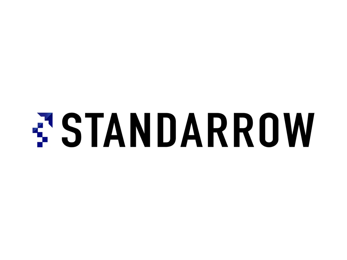
StandArrow, Inc. has renewed its service logo and icon, both to pursue further growth and to embody our identity in a more symbolic way.
Concept
The logo symbolizes a growth process that moves from “standing” to “flying.” The stacked blocks represent building results and trust one step at a time, and the arrow extending beyond them signals the leap that lies past every challenge.
This structure visualizes a relationship in which the client, the person in charge, and our team co-create as one. First we stand firmly and solidify the foundation, then we move on to the next height. As we run alongside that journey, we change shape as circumstances require and build the best strategy. The logo carries our commitment to cycling between building up and accelerating, and to delivering sustained growth.
Symbol Mark
The blocks, assembled step by step, show a structure that layers results and trust. The arrow, extending in a straight line, expresses the acceleration and direction that this accumulation creates. The form combines static stability with dynamic momentum.
Logotype
We adopted DIN Alternate Bold. It offers industrial precision and functional beauty, ensuring legibility and a sense of stability. It is designed so that the concept of “standing” is supported by strong footing.
Design Principles
Externally, we build up results and lead clients to a leap forward. Internally, we accumulate trust and remain a self-driven organization. The cycle between “standing” and “flying” is our guiding principle.
Brand Colors
The brand colors are designed to visualize a relationship of co-creation and close support.
Deep navy (#000985) represents an unshakable foundation and strategic thinking. Blue (#2a5ab8) is the middle ground that carries dialogue and flexibility. The orange accent (#ff6a33) marks the starting point of action and forward movement. In addition, pale tones (#ffcca4 / #fff7ed) soften the whole palette, giving the relationship room to breathe and warmth.
People with different positions and backgrounds look in the same direction and move forward together. We have structured that state with a 60-30-10 balance. It is a color scheme in which strength and softness coexist.
With our new logo and icon, we will keep pursuing the value we should provide and strive to continue meeting your expectations.
If you have any questions about our services or would like to discuss them, please feel free to contact us.